Toni Moses Design
A website that balances function and form
Involvement
— Brand identity
— Website design and development
— Website design and development
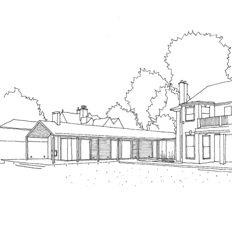
Toni Moses Design is an architectural practice based in Saffron Walden. Their contemporary buildings play with space creatively, mixing the inside with out and delivering buildings that marry function and form. They create unique one-off homes that transform the lives of their clients.
Starting with a limited budget, we were asked to create a simple website that reflected the values and outlook of Toni Moses Design. To help them build their online profile, reach more potential clients, better communicate what they offer and add value to their business.
tonimosesdesign.com
Starting with a limited budget, we were asked to create a simple website that reflected the values and outlook of Toni Moses Design. To help them build their online profile, reach more potential clients, better communicate what they offer and add value to their business.
tonimosesdesign.com
Involvement
— Brand identity
— Website design and development
— Website design and development
Our process
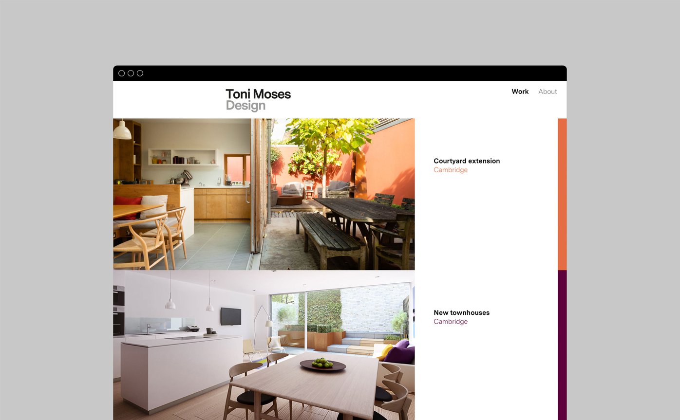
We conducted a content audit, which highlighted a library of beautiful hi-resolution imagery that was being under-utilised, so we put these front and centre of the design.
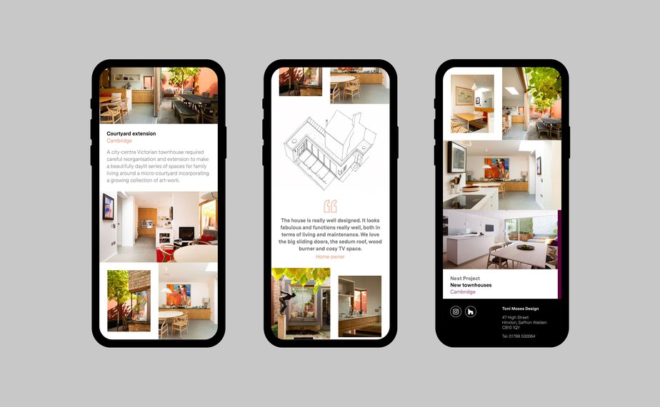
We created simple wireframe designs and reduced the website structure to three page styles, with several layout options. The website has been meticulously built, scoring 100% for performance, accessibility, best practice and Search Engine Optimisation. The website also works as a progressive web app.
We created simple wireframe designs and reduced the website structure to three page styles, with several layout options. The website has been meticulously built, scoring 100% for performance, accessibility, best practice and Search Engine Optimisation. The website also works as a progressive web app.
Function and form
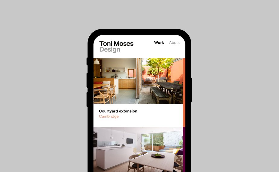
We created an online experience that represents the physical buildings Toni Moses Design conceives. The website is clean and uncluttered, it balances function and form and gets the details right. It is a space where potential clients can immerse themselves in the large images and fully responsive design.
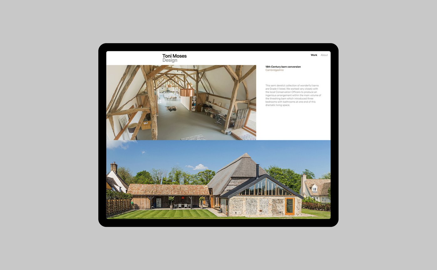
We created the Toni Moses Design logo
My first meeting with Very Own Studio set the tone for an extremely enjoyable process. They were very responsive from the outset to my brief - to produce something special, ‘small but lovely’ and they more than exceeded my expectations. I am delighted with the result, I have had very positive feedback from everyone who has visited the site so far.
Toni Moses
Toni Moses Design
Toni Moses Design


Contributors
Mark Ferguson: Project lead, design/creative direction
Andy Mathieson: Website Development
Jim Stephenson: Photography
Andy Mathieson: Website Development
Jim Stephenson: Photography
