Edward Street Quarter
Building a brand for Brighton’s £120m property redevelopment
Involvement
— Brand positioning, tone of voice and narrative
— Name creation
— Brand identity, guidelines and toolkit
— Editorial design
— Art direction of still and moving image
— Spatial design
— Website design and development
— Name creation
— Brand identity, guidelines and toolkit
— Editorial design
— Art direction of still and moving image
— Spatial design
— Website design and development
First Base are redeveloping a site in Brighton that was previously home to a 1960s Amex House. The development – the largest mixed use project in the city for 25 years – will regenerate the area by providing much needed homes, offices, and public space.
We were commissioned to create a distinctive and memorable brand for the development. A brand that demonstrated the vision to support and nurture Brighton’s vibrant communities by building welcoming and beautifully designed spaces to work, live and play.
edwardstreetquarter.com
We were commissioned to create a distinctive and memorable brand for the development. A brand that demonstrated the vision to support and nurture Brighton’s vibrant communities by building welcoming and beautifully designed spaces to work, live and play.
edwardstreetquarter.com
Involvement
— Brand positioning, tone of voice and narrative
— Name creation
— Brand identity, guidelines and toolkit
— Editorial design
— Art direction of still and moving image
— Spatial design
— Website design and development
— Name creation
— Brand identity, guidelines and toolkit
— Editorial design
— Art direction of still and moving image
— Spatial design
— Website design and development
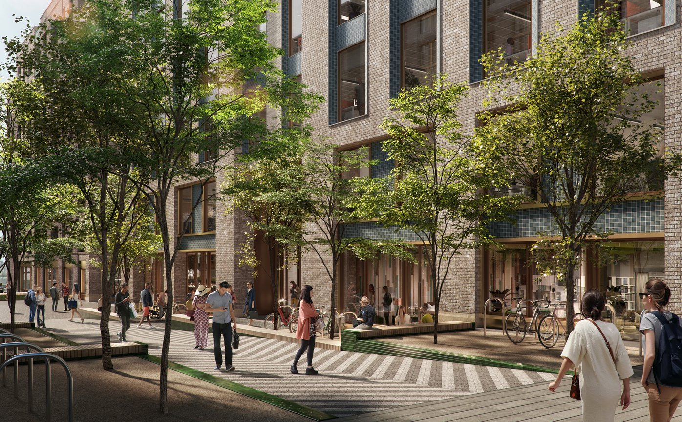
CGI image by F10 Studios
Getting the foundations right
Our starting point was to establish a strategy and brand narrative for the development. We helped our client define their purpose, vision, mission, values and personality. We also worked with them understand what makes them different from the competition and where they fit into the market. This was boiled down to the positioning line:
Space to Grow
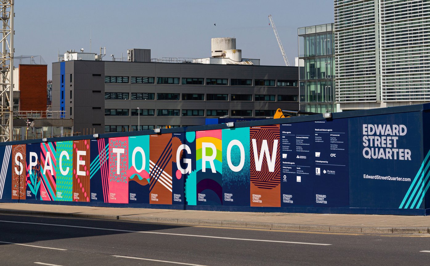
Edward Street hoardings with the Space to Grow message
Full service
Very Own Studio worked on all aspects of the brand, creating a striking visual identity and designing all marketing materials. We were involved in naming the development and buildings. This involved polling local residents to gauge opinion and representing these findings.

Visual identity
The logo has four strands — a subtle nod to the word quarter, it has been designed to animate as movement is a key part of the visual identity.
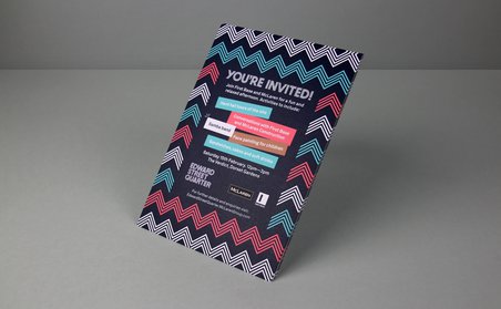
The visual identity uses a modern colour palette inspired by the materials used in the development. We selected a family of typefaces, created image and illustrative style guides and a range of graphic devices, and layout structures. This is all covered in a detailed but flexible identity guide. We were mindful that any brand assets need to work as well in small sizes such as on social media as they do a huge bill boards, so this was designed into the overall identity system.
The visual identity uses a modern colour palette inspired by the materials used in the development. We selected a family of typefaces, created image and illustrative style guides and a range of graphic devices, and layout structures. This is all covered in a detailed but flexible identity guide. We were mindful that any brand assets need to work as well in small sizes such as on social media as they do a huge bill boards, so this was designed into the overall identity system.

Alternative logo versions
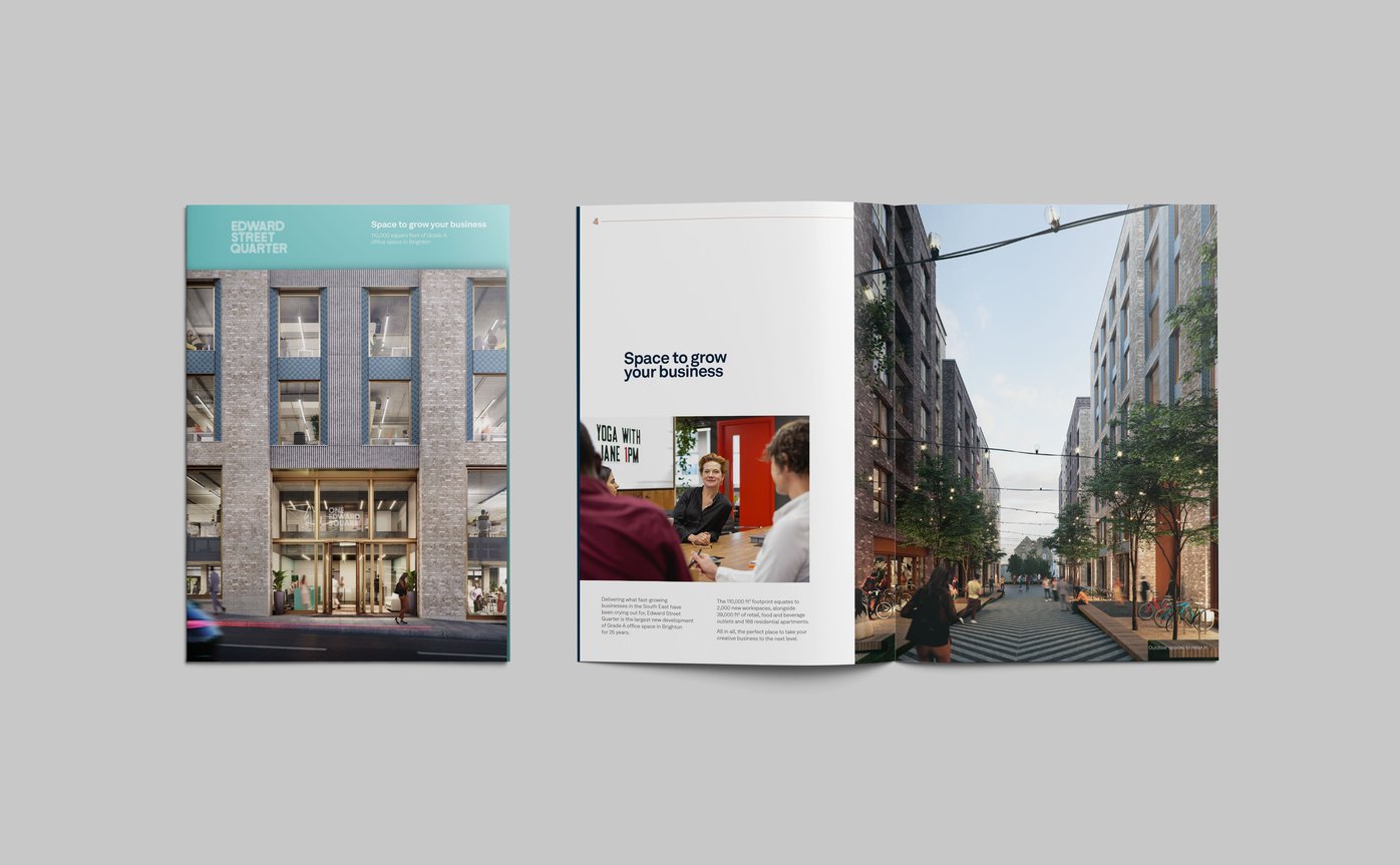
Office brochure
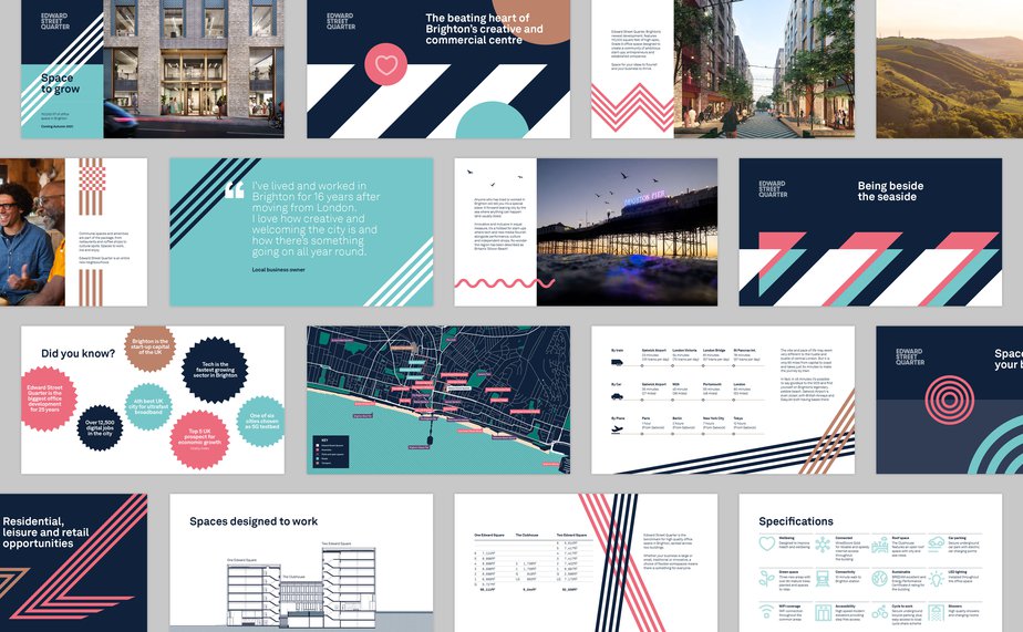
Digital presentation document
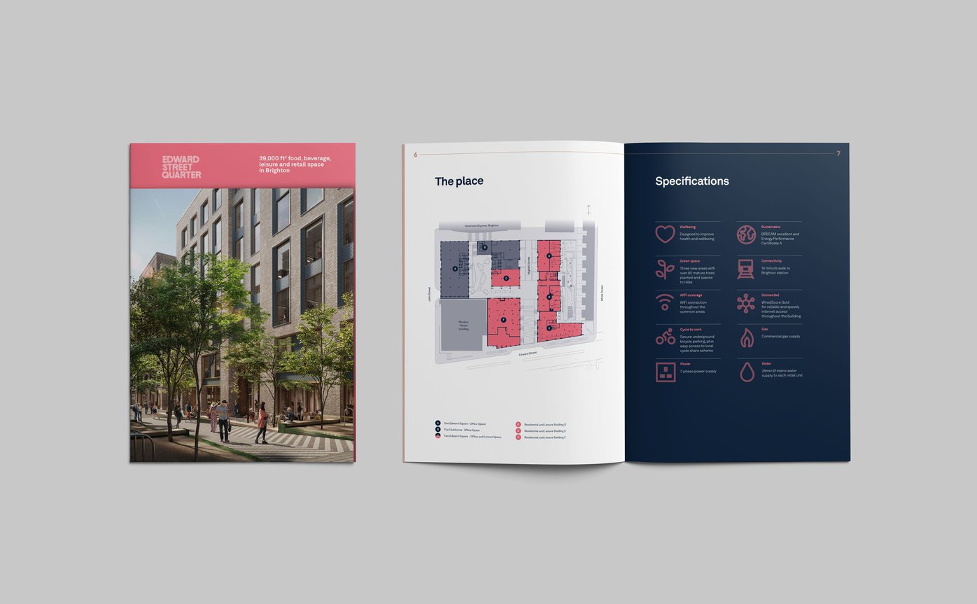
Food, beverage, leisure and retail brochure
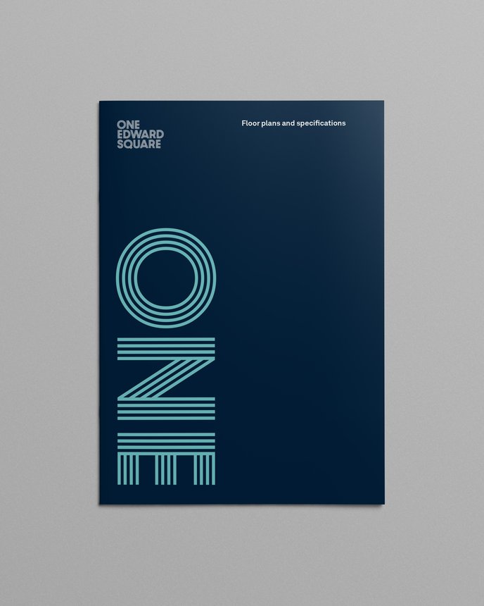
One Edward Square floor plan cover
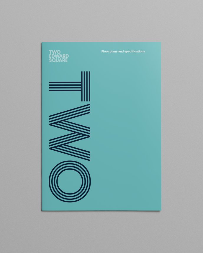
Two Edward Square floor plan cover
Very Own Studio worked on all aspects of the brand, creating a striking visual identity and designing all marketing materials. All creative elements were cross checked against the brand narrative to ensure consistency of message.

The stripe graphic runs through the whole visual identity
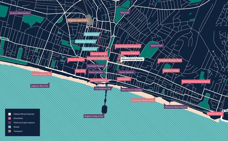
Digital
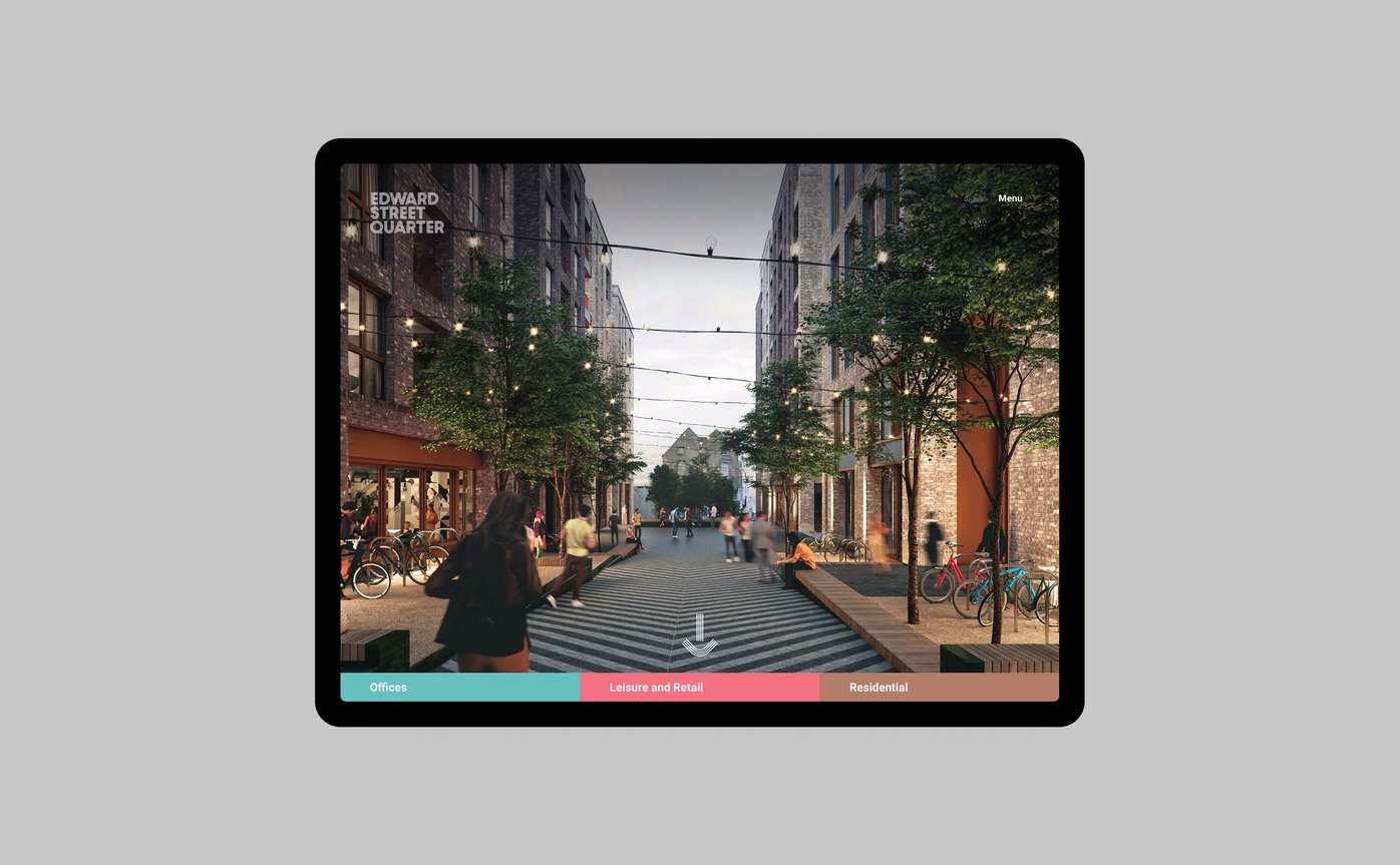
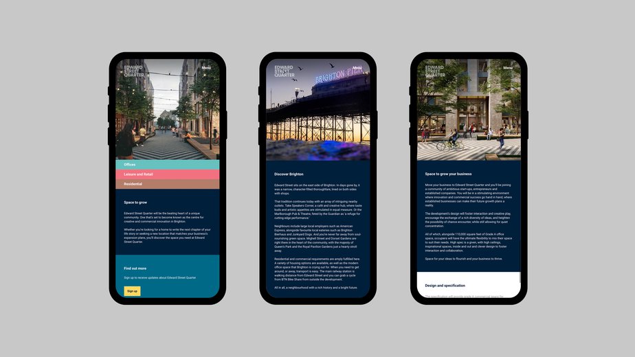
Website and video


Picture this
We worked with local photographer Kevin Meredith to capture the essence of Brighton. We co-ordinated and directed several photoshoots to illustrate life in the city and follow the progress of the build.

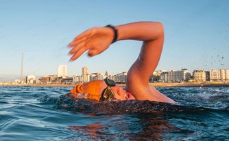
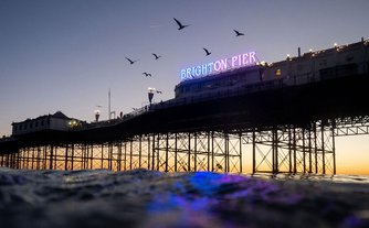
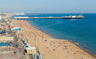
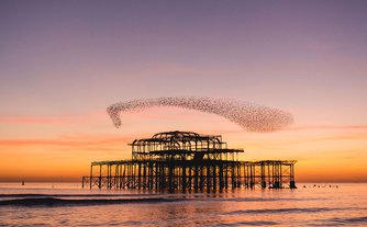
Showing the best of Brighton
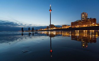

Showing the best of Brighton
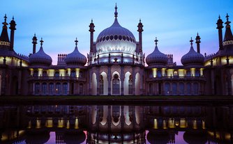

Live, work and play

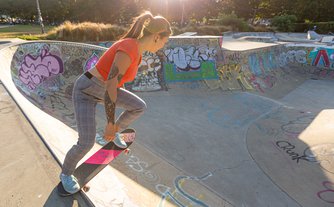
Live, work and play

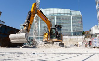
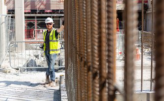
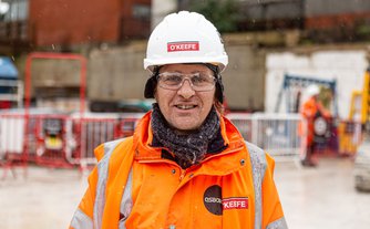

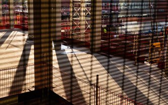
Documenting the build
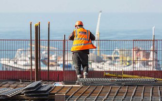

Documenting the build
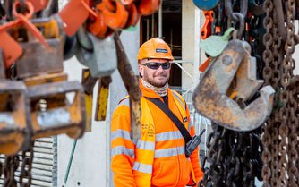
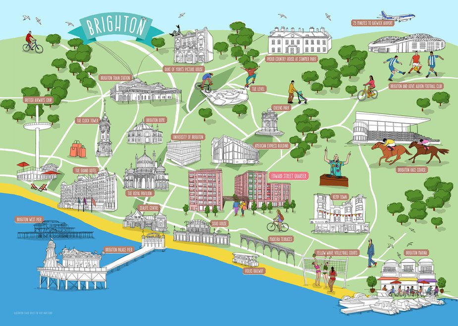
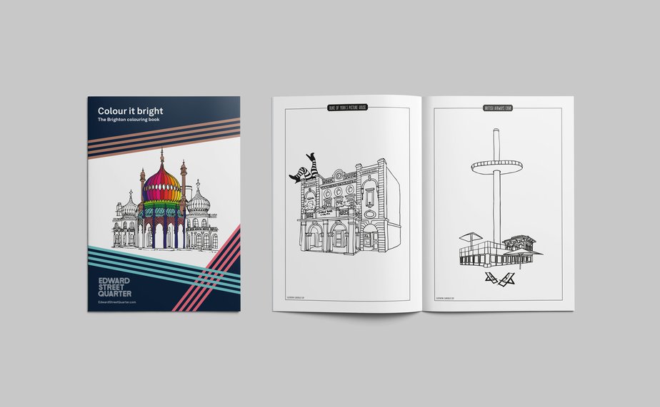
Illustration by Claire Rollet
Very Own Studio clearly understood our brief and helped this evolve as the project developed. They created a memorable brand that reflected our vision and values. They consistently deliver high quality designs with great attention to detail.
Olaide Oboh
Director of Partnerships, First Base
Director of Partnerships, First Base



Contributors
Mark Ferguson: Project lead, design/creative direction, positioning and narrative
Anne Stafford: Project management
Ty Abiodun: Design
Shelley Smith: Brand positioning, tone of voice and narrative
Andy Mathieson: Website development
James Huson: Animation
Standard 8: Production of signage
Kevin Meredith: Photography
Jim Stephenson: Video
Claire Rollet: Illustration
F10 Studios: CGI images
Walk the Room: CGI images
