Involvement
— Brand positioning, tone of voice and narrative
— Name creation
— Brand identity, guidelines and toolkit
Plastic Free Pledge started life as a local campaign to reduce the amount of plastic straws being used at venues in Brighton. It soon spread to include other towns and cities across the UK. The campaign has now grown in to an international movement and is tackling other single use plastics.
To help Plastic Free Pledge in their mission to grow gain more attention and further the cause we were briefed to redesign their visual identity. Following consultation it was agreed that they needed a simple and positive identity with a friendly international feel that could easily be applied by the organisation themselves.
Involvement
— Brand positioning, tone of voice and narrative
— Name creation
— Brand identity, guidelines and toolkit

Helping the movement take flight
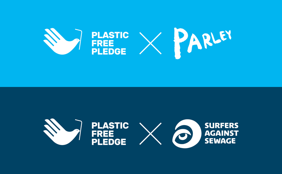
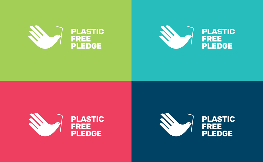
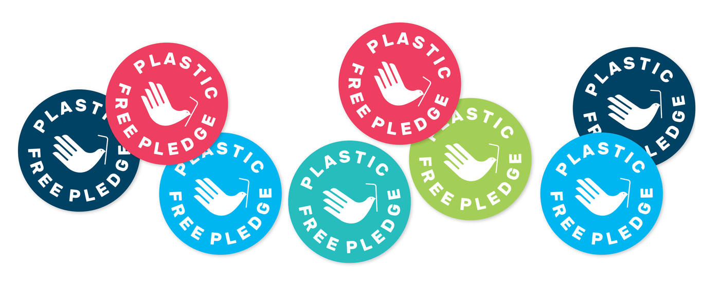
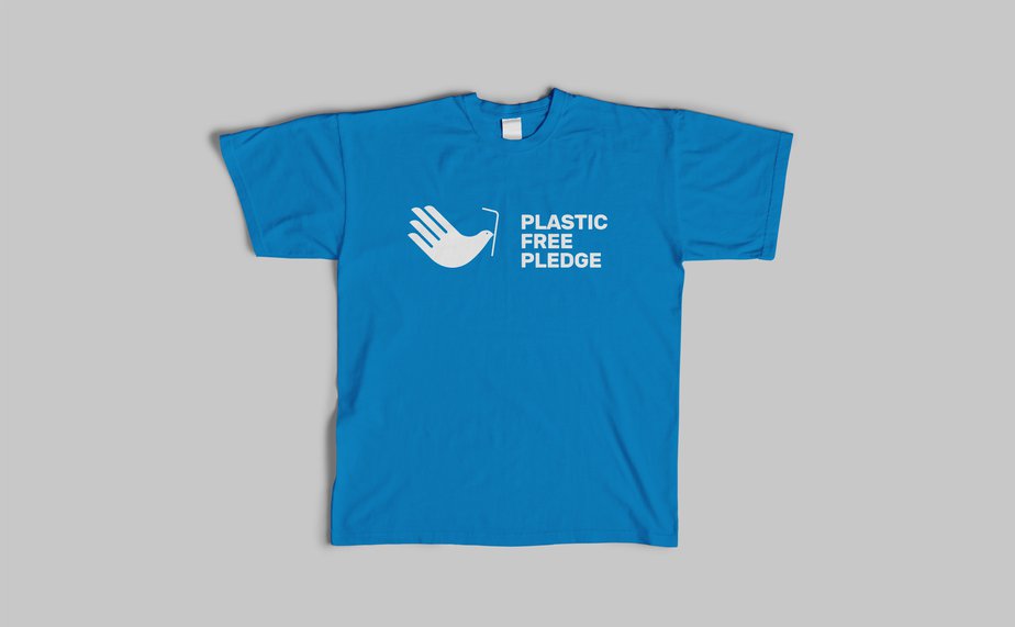
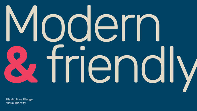
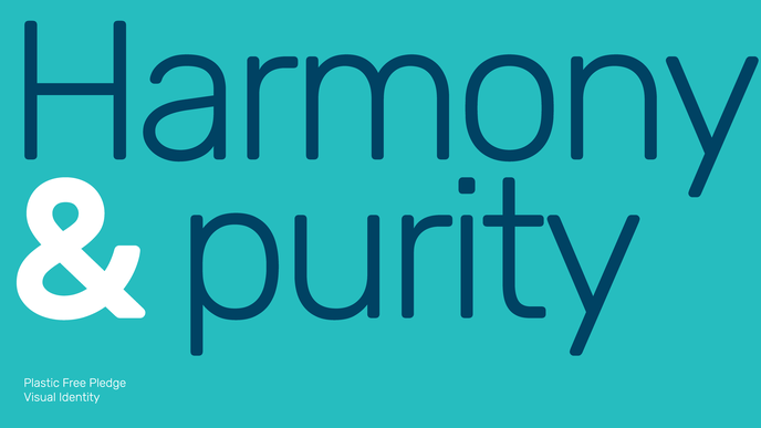
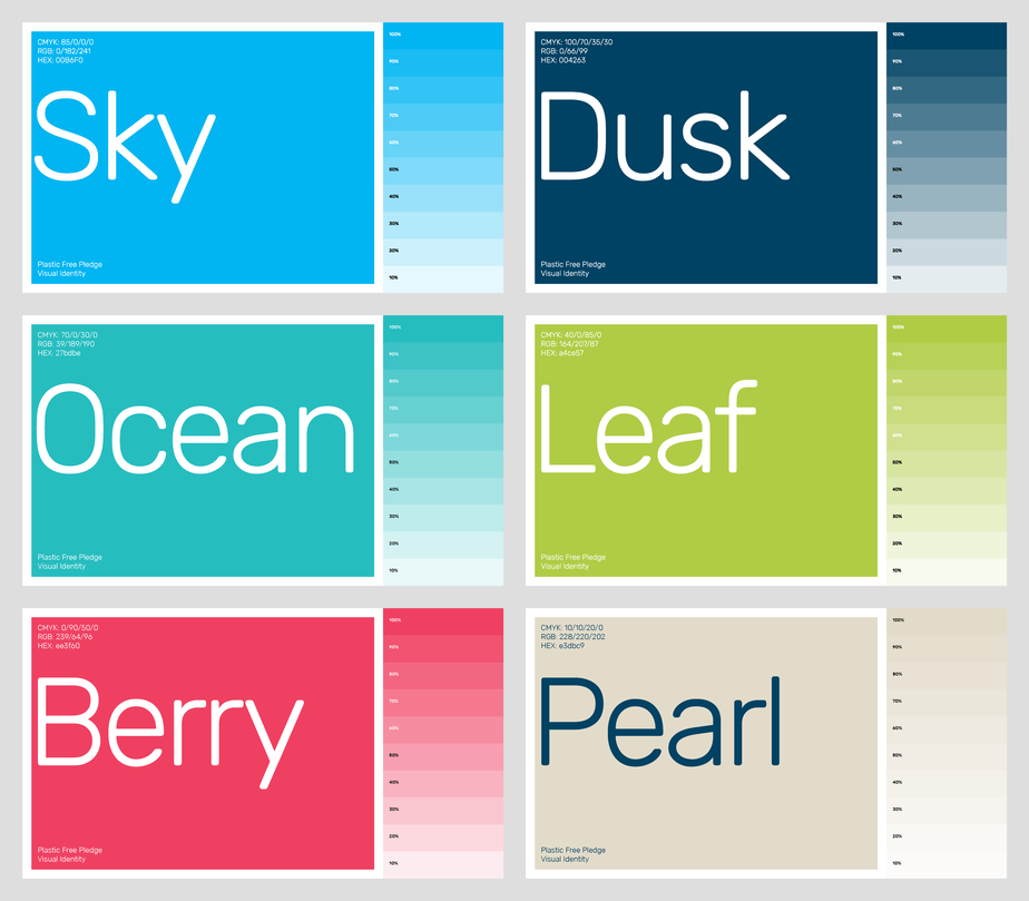
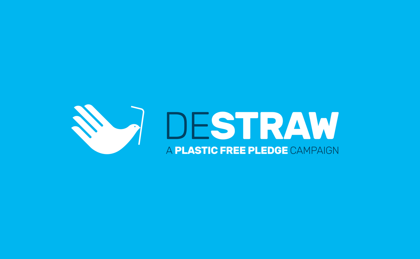
We designed a logo that represents a pledge or oath, made by holding one hand up, but combines this with the image of a dove, a symbol of freedom, peace and love, known for its ability to carry messages. The bright, modern and friendly colour palette using natural sky blue and greens hint at nature, while beige, red and navy offer contrast. As well as the usual visual elements such as logos, colours, graphics and typefaces, we also created campaign ideas and a naming structure.

Since launching the new identity, Wahaca and Leon, plus many smaller independent restaurants have signed up to the Pledge.
Mark Ferguson: Project lead, design/creative direction, positioning and narrative
A big thank you to Claire Potter and Jake Arney for their input on this project.